Cuidance
A beauty app that tells you why advice fits you. We're halfway through building it, and this page says what we've decided and what we haven't tested.
- Role
- Researcher and designer, shared ownership with Esme B.
- Team
- Alyssa Ramirez and Esme B. (professional designer)
- Timeline
- Fall 2026, ART 646 practicum, CSUN
- Status
- In progress. The prototype has been tested with other teams. Updated as the project moves.
- Methods
- Secondary research, competitive review, journeys, flows, MoSCoW, sitemaps, wireframes, prototype
- Tools
- Figma, FigJam, Slack, Claude, ChatGPT, Perplexity
This is an ongoing project. We have tested the prototype with people on other teams and are writing up what we learned. The findings below come from secondary research, a competitive review and critique from our instructor. Test results will be added here as they are written up.
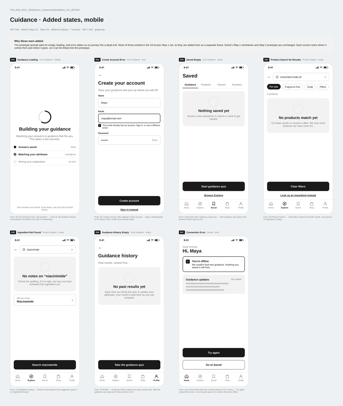
My part and Esme B.’s. Esme built the wireframes and the clickable prototype. I built a nine-company competitive landscape, reviewed the user flows, added the missing loading, error and empty-state screens, rebuilt the brand directions board, and wrote the notes that fed the next prototype version.
The Problem
Search for beauty advice and you get TikTok, YouTube, Google and retail sites, all saying different things. None of them can tell you whether it fits your skin, hair or experience level before you try it.
So we asked: how might we help someone understand their own beauty attributes and find guidance that actually fits them?
Guessing is the core problem. The product has to accept “I don’t know.”
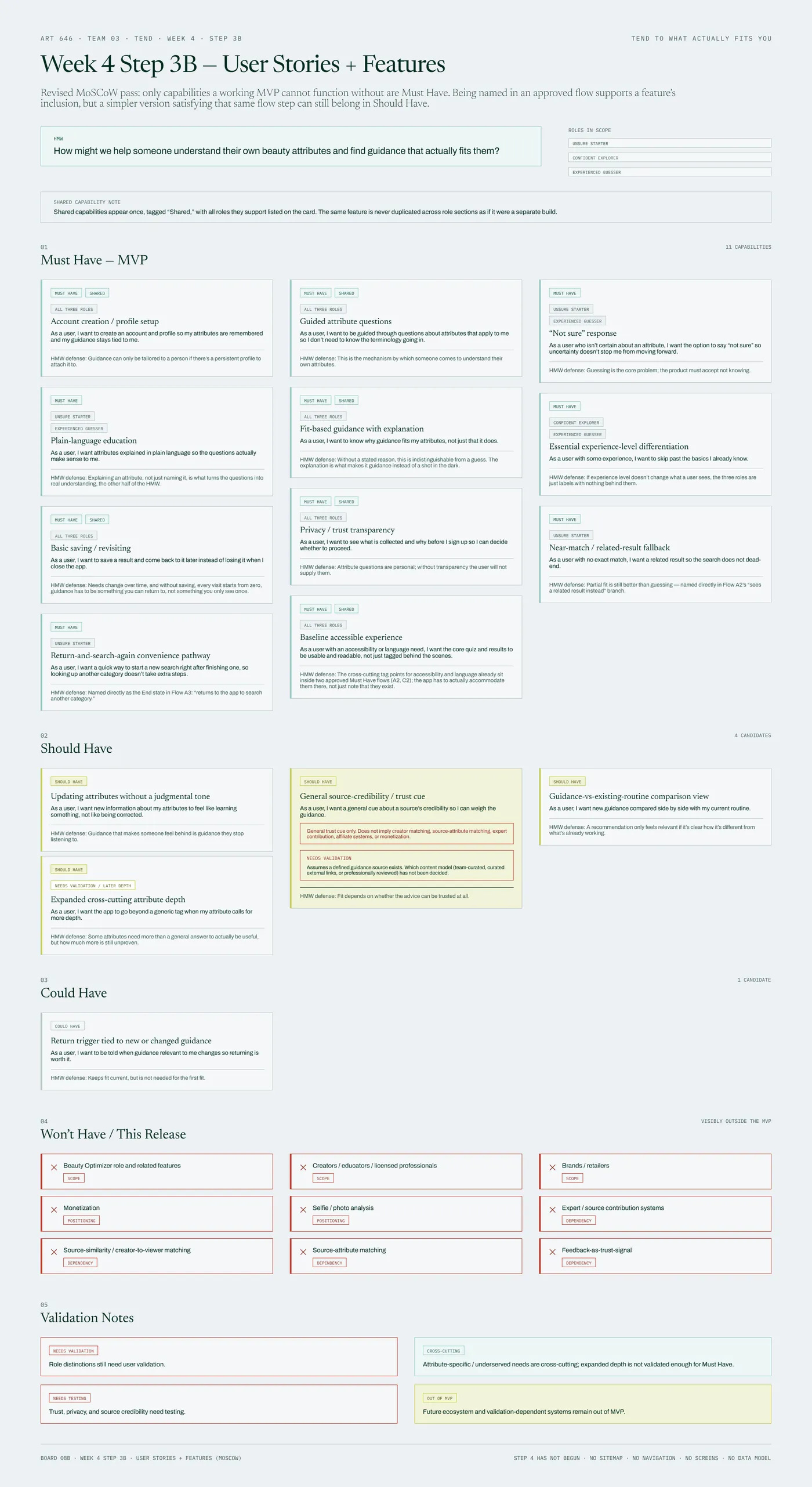
From our feature prioritization board, where 'Not sure' became a Must Have.
From Research to Decisions
| What we found | What people need | What we decided |
|---|---|---|
| Social media skincare advice often conflicts with evidence-based care. A Pediatrics study found TikTok skincare content pushed costly, irritating routines to teens. Secondary Research | Guidance sorted by who it's for, with the reasoning visible. | Every result says why it fits you. |
| Sensitive skin is common and often self-identified. People label their own skin, hair and undertone with mixed accuracy. Secondary Research | A way to answer honestly without knowing the terms. | A "Not sure" answer where it helps, with plain-language explanations next to each question. |
| People want personalization and informed choice, and they're tired of viral fads. "Clean" labels for textured hair aren't standardized. Secondary Research | Guidance they can believe. | A small, curated, tagged library instead of live search across platforms. |
| Most direct competitors lean on AI photo analysis or sell their own products. Research suggests AI tools can shape how people see their own skin. Secondary Research | Self-discovery without a camera. | A guided quiz instead of photo analysis. It also fits what two people can build in a semester. |
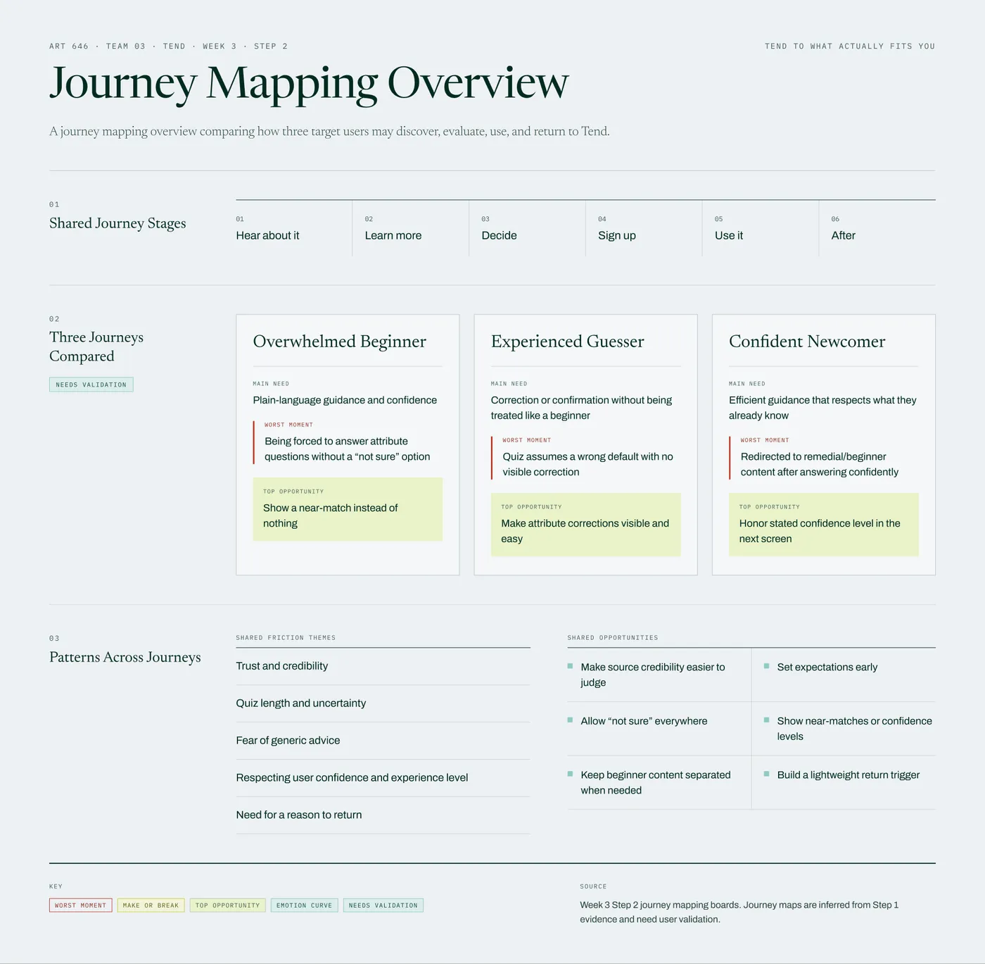
| In our journey maps, a beginner, an experienced user and a confident newcomer each hit a different worst moment: no way to say "not sure," a quiz that guesses wrong, and beginner content after a confident answer. Hypothesis | Room for uncertainty, easy corrections, and respect for what people already know. | Experience level changes what you see, and a near-match beats an empty result. |
Guidance should be personal and explained. Never quietly shaped by what’s for sale.
Adapted from our brand brief.
What Else Shaped It
| Why | What it means for the app | What we decided |
|---|---|---|
| Trust and source credibility kept coming up in the research. Design Decision | People should be able to tell guidance from advertising at a glance. | A free, neutral MVP. Partner content gets a visible "Paid partner" label and can never replace "why this fits you." |
| Accessibility was only an optional extra until our prioritization review caught it. Design Decision | People with accessibility or language needs must be able to use the core quiz and results. | "Baseline accessible experience" became Must Have number 11. |
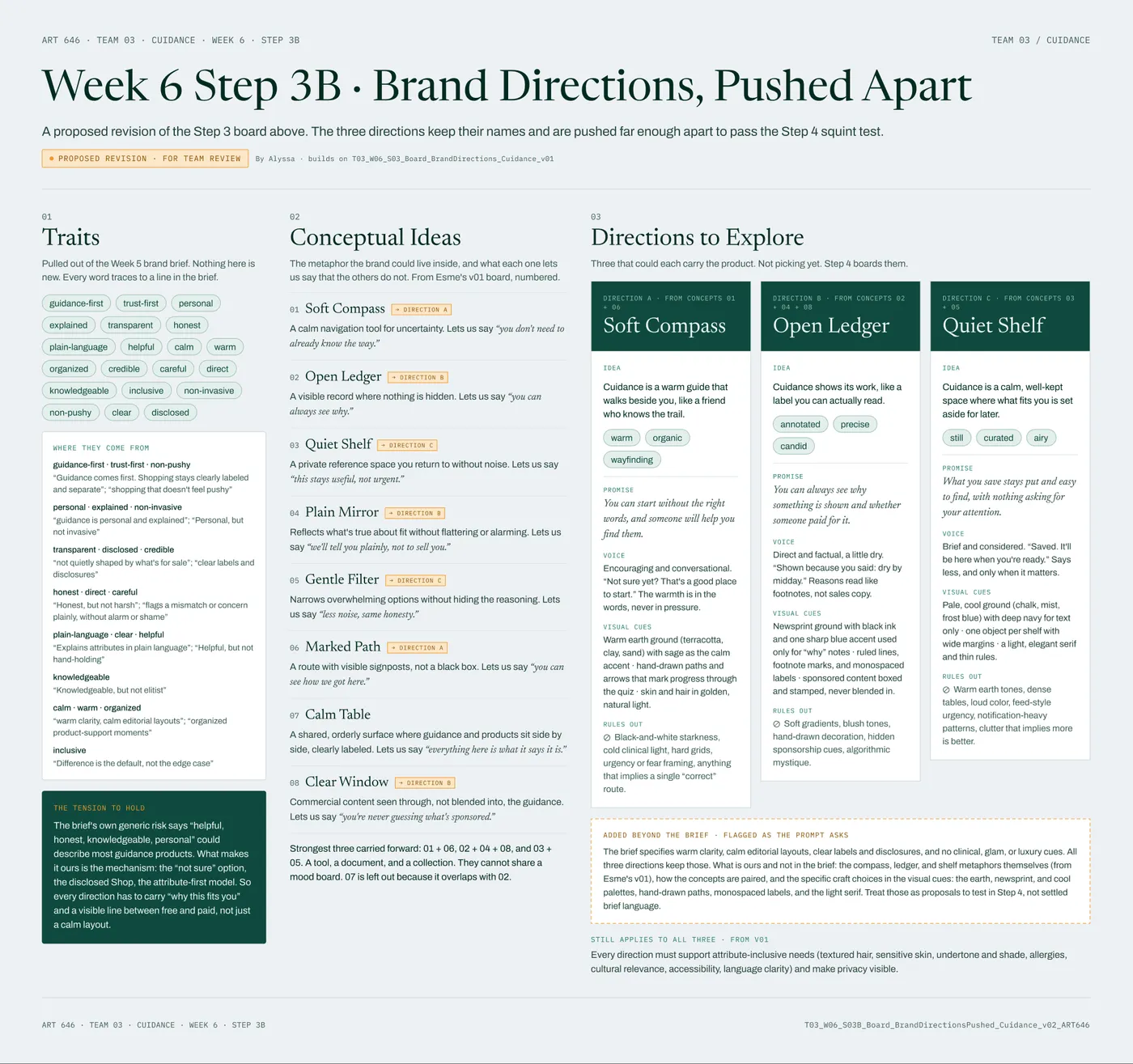
| We reviewed how competitors look, and we want to keep people who find beauty apps too feminine. Design Decision | A calm, inclusive look that isn't glossy. | A wellness-leaning direction. Three are drawn up and we haven't picked one. |
One Rule for What Makes the Cut
A feature is a Must Have only if an approved flow needs it and no simpler version would do. The rule caught three features we had over-promoted. With accessibility added, we have 11 Must Haves, 4 Should Haves and 1 Could Have, and every card says why it’s there.
Where It Is Now
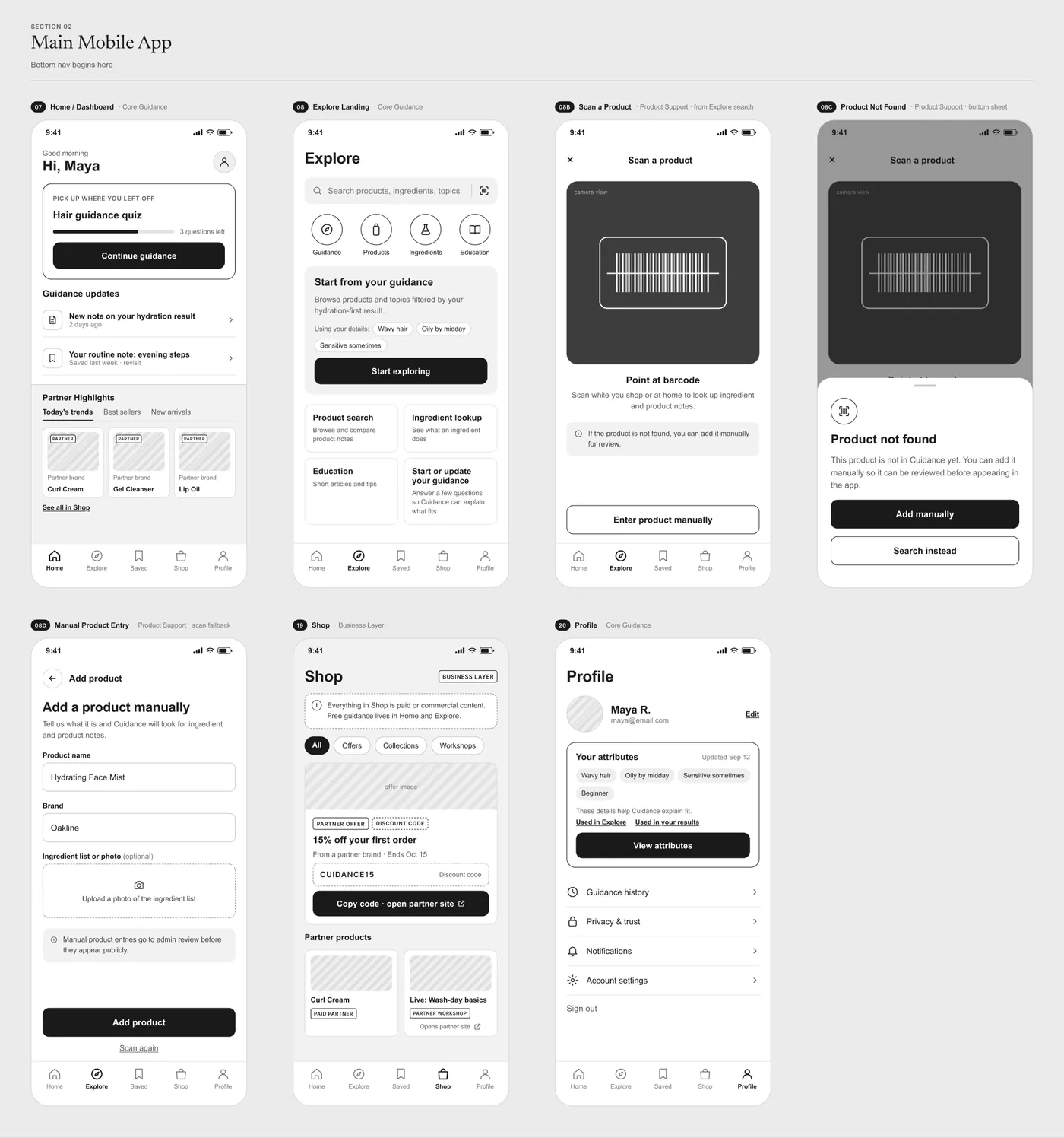
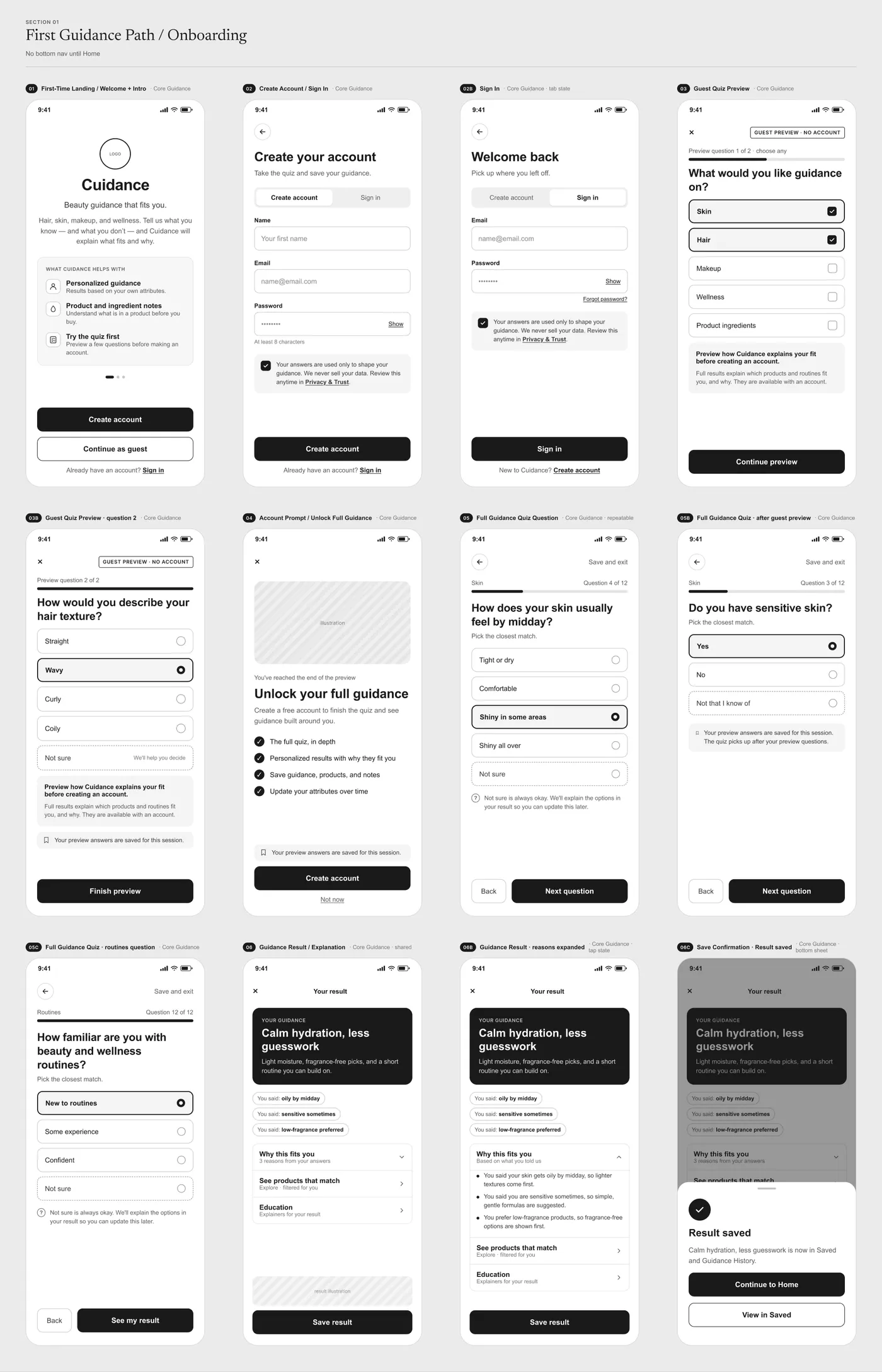
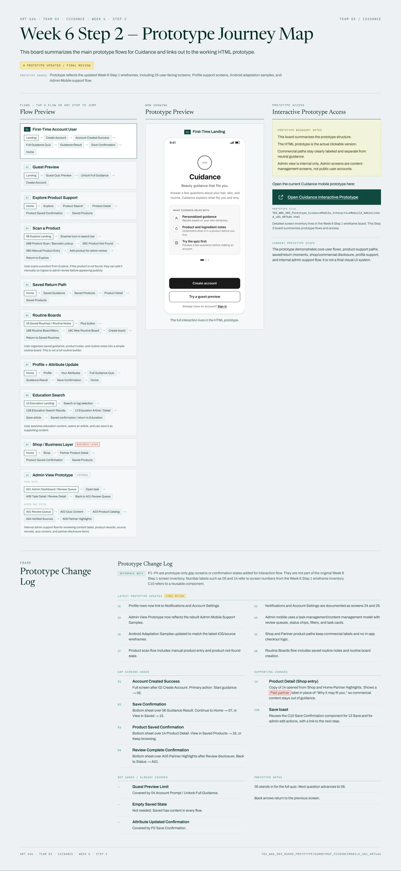
The grayscale wireframes are at 25 screens plus 14 states. Esme built them and the clickable prototype, which now runs ten flows: first-time account, guest preview, product search, barcode scan with manual entry, saved items, routine boards, profile updates, education search, Shop (clearly labeled, with no checkout) and an internal admin view. We have no high-fidelity screens yet.
We also pushed the brand into three directions that look different from across a room. We haven’t chosen yet.
What the Test Was Designed to Answer
Tested, Results Pending In Week 7 we tested whether people understand what Cuidance does, whether the guest preview and sign-up path make sense, whether the result is clear and useful, whether the five tabs are easy to move around, whether the “Paid partner” labels read the way we meant them, and which visual direction people like. Results are not written up yet.
After that: high-fidelity screens and a design system (Week 8), then the build and a live beta (Weeks 9 to 13), and a final walkthrough in Week 16.
Process notes
How Esme and I worked
Esme is a professional designer, and we’re a team of two. We did every step together, and each of us approves every board and can correct it. Each of us owns the whole project.
Several steps began as two drafts. In Week 2 we each built a competitive landscape (mine covers nine companies, hers adds scanners like Yuka and Think Dirty) and combined them. In Week 3 we each drafted user roles. Esme built the wireframes and prototype. I reviewed the user flows, added the missing screens (loading, errors and empty states), rebuilt the brand directions board, and wrote the notes that fed the next prototype version.
How we used AI
ART 646 expects AI use and asks for disclosure, and each weekly board records the model and prompt. We used ChatGPT and Claude to draft and structure boards (Claude connected to Figma for layout), Perplexity to find sources, and Namelix for name ideas. AI drafts and we decide. When one early competitor-screenshot board turned out to hold screens we couldn’t verify, we rebuilt it and marked every unconfirmed screen.
How the user roles came together
Esme’s draft roles were the Overwhelmed Beginner, Experienced Guesser, Confident Newcomer and Beauty Optimizer. Mine were an attribute-unsure beginner, an underserved expert and tutorial creators. In Week 4 we merged them into three roles for the MVP: the Unsure Starter, the Confident Explorer and the Experienced Guesser. A layer of attribute-specific needs, like sensitive skin or textured hair, cuts across all three. Beauty Optimizers, creators and brands went to a future backlog. These roles come from research and our own thinking, and they still need real people to check them.
Fixing the sitemap
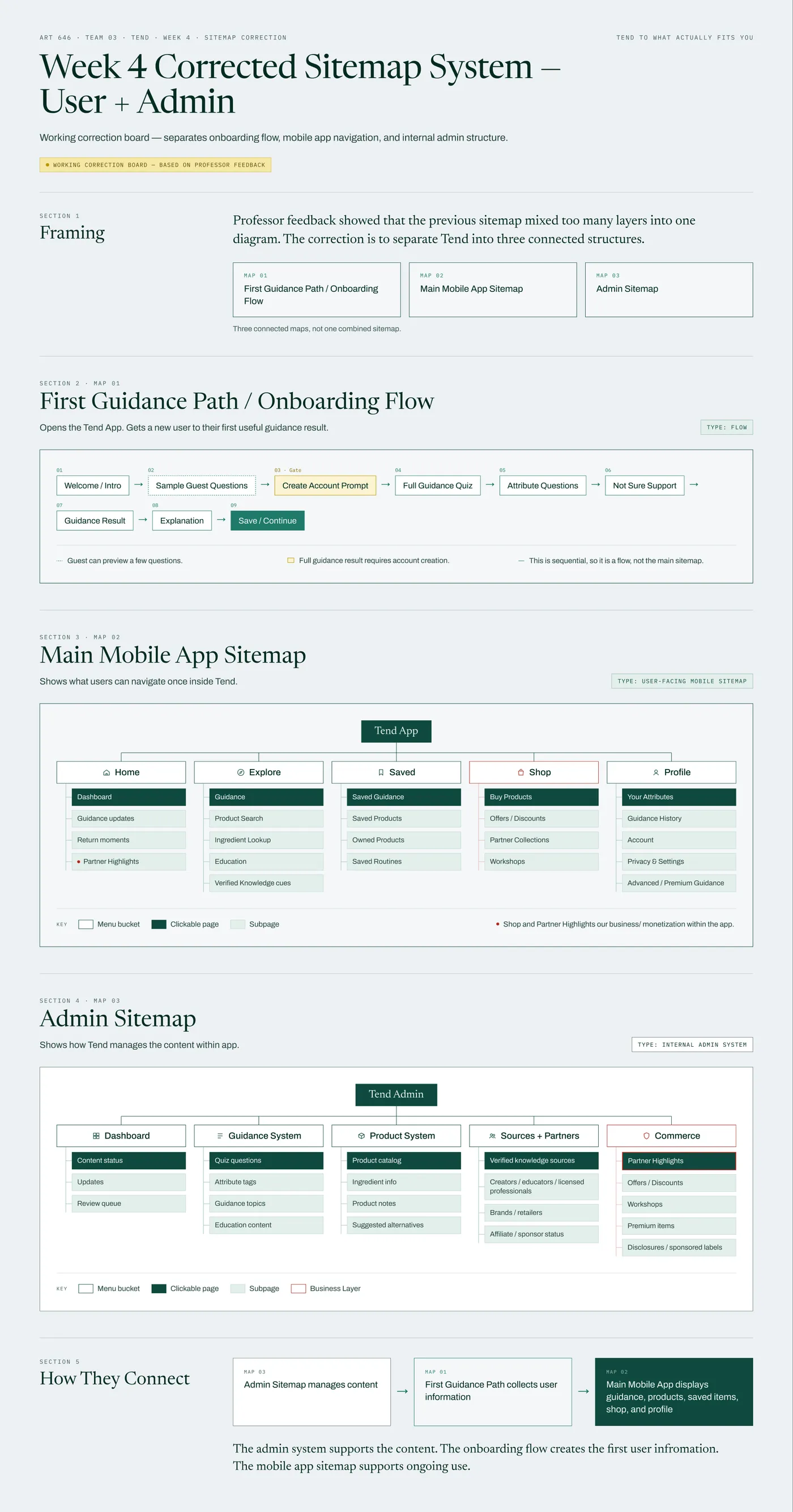
Our first sitemap mixed too many layers, and our instructor said so. We rebuilt it as three connected maps: the first-use path, the main app with five tabs, and the admin system. We also fixed two flow branches that were backwards, and the content sheets grew to 20.
How the name changed
It started as Beauty Search, became Tend, and is now Cuidance. For the name study we generated 500 names and checked nearly 300 on September 23, 2026 against domains, GitHub, app stores and trademarks. Tend failed: the domains and GitHub handle were taken, other apps use it, and active trademarks exist in skin and hair care, which matters because we have a Shop tab. “Cuida” is Spanish for care, and the name adds “guidance.” Our instructor approved it after crit. Final legal follow-up is still open.
Notes that became changes
After I walked through version 2 of the prototype, I sent Esme notes tagged Change, Wording, Question and Idea. Four are in the current version: a friendlier intro line, “Continue as guest” in place of “Try a guest preview,” the scan flow (with manual entry going to an admin review queue), and routine boards.
Still open: how people buy in Shop, what the Saved > Guidance tab is for, and how far wellness advice can go without medical claims.
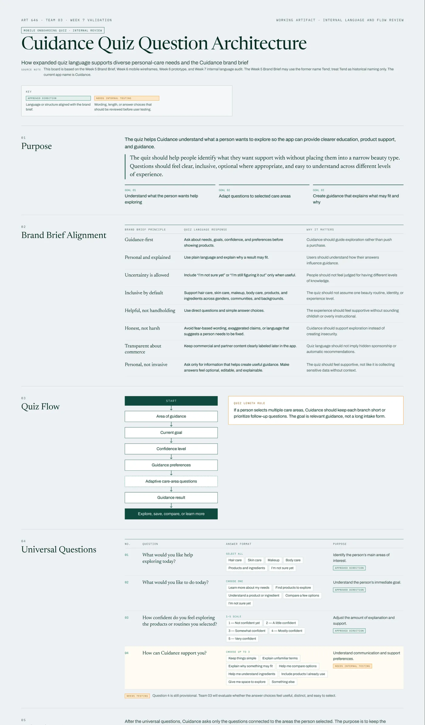
The Week 7 quiz language audit
Before testing, we reviewed our own quiz wording. The draft now opens with four universal questions, then adds short branches for hair, skin, makeup, body care, and products and ingredients. It also questions one of our rules: we’d planned a “Not sure” answer everywhere, but for plain descriptive questions like hair texture the draft drops it and offers softer options like “I’m still figuring it out” where they fit. Question 4 is provisional until we test it.