A24 x Warner Bros. Discovery
A made-up acquisition, designed as a protection document. A24 leads. Warner Bros. Discovery funds the infrastructure and stays out of the creative.
- Role
- Solo. Brand strategy, logo system and guidelines
- Team
- Solo project
- Timeline
- ART 645 Design Strategy and System Practicum, CSUN
- Status
- Complete (course project). A hypothetical acquisition, not real client work.
- Methods
- Brand and acquisition research, audience analysis, moodboards, two visual directions, critique
- Tools
- Adobe Illustrator, Adobe Photoshop, Canva, Figma
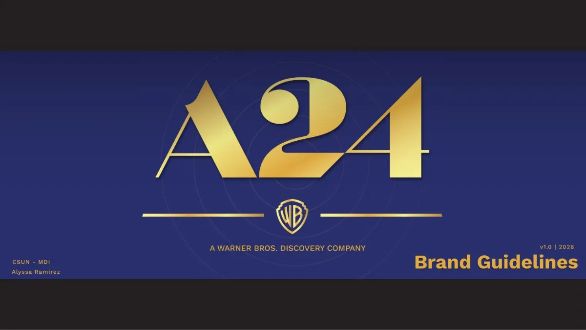
A24’s value is inseparable from its perceived independence.
From my project brief.
The Problem I Set Myself
Fans of A24 are protective for a good reason: if the name is on a film, it means something. If Warner Bros. Discovery’s fingerprints show on creative decisions, that trust weakens, and the trust is what WBD would be buying. So I built the guidelines as a protection document with one filter for every choice: does this protect A24’s identity or compromise it?
My part: solo, from research through the final guidelines, with feedback from my professors.
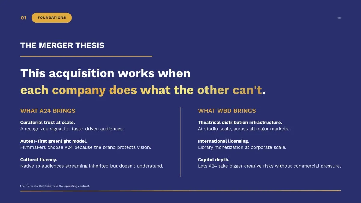
Decisions and the Reason for Each
| What I saw | What it meant | What I decided |
|---|---|---|
| My first WBD endorsement mark kept reading like a park ranger shield: too big and too authoritative. Design Decision | WBD should be a hint of infrastructure, not a co-author. | A smaller, subordinate shield that reads like a notation. |
| HBO stays plainly HBO inside WBD, which shows the approach can work. Design Decision | A24 needs the same room to stay itself. | A governance model that puts A24's identity first. |
| Two visual directions pulled apart: The Criterion (archival, still) and The Signal (kinetic, charged). Design Decision | A system that feels permanent and also moves forward. | Restraint from The Criterion for type and space. Direction and energy from The Signal for the logo and color. |
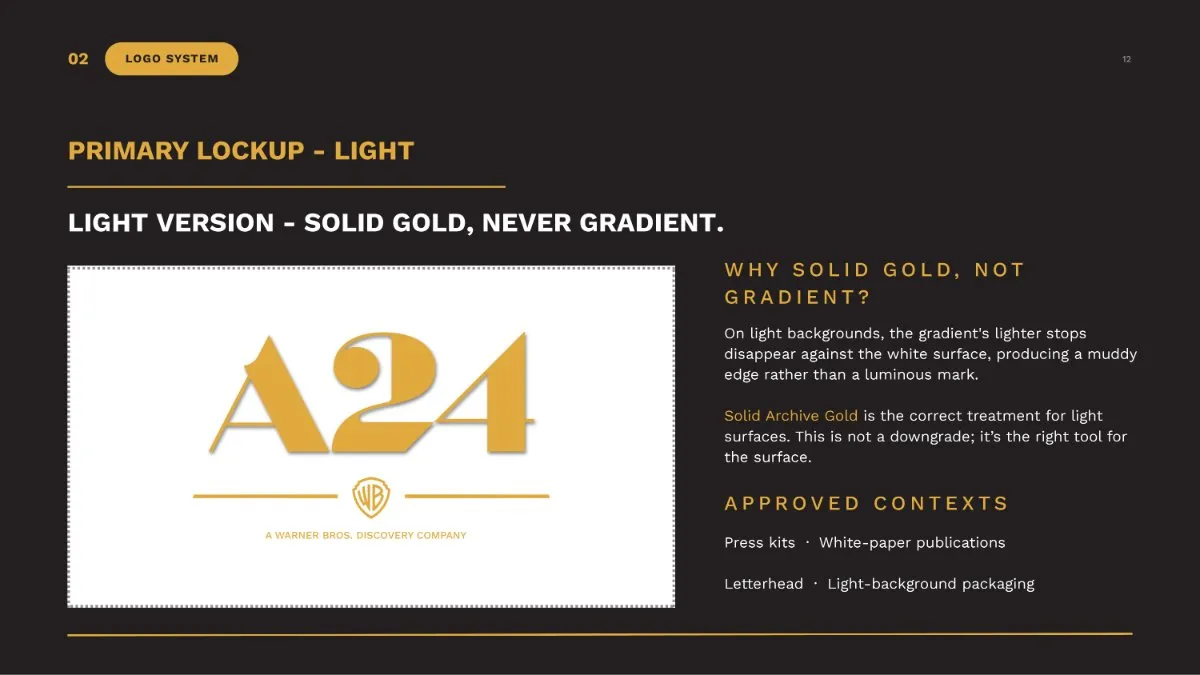
| On light backgrounds, a gold gradient's pale stops disappear against white. Design Decision | A mark that stays legible everywhere. | Solid gold on light surfaces, gradient only on dark, and written rules on misuse. |
Accessibility Is Built Into the System
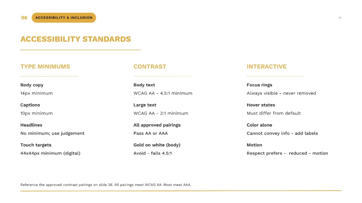
The color system is a working palette with tints for interface backgrounds and shades for pressed and focus states, and every approved pairing passes WCAG AA. A separate standards page sets minimum type sizes, visible focus rings, hover states that differ from default, and respect for reduced motion. It also says plainly that gold on white fails for body text.
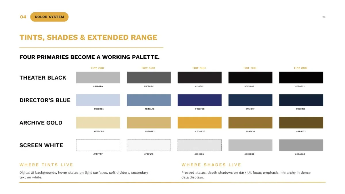
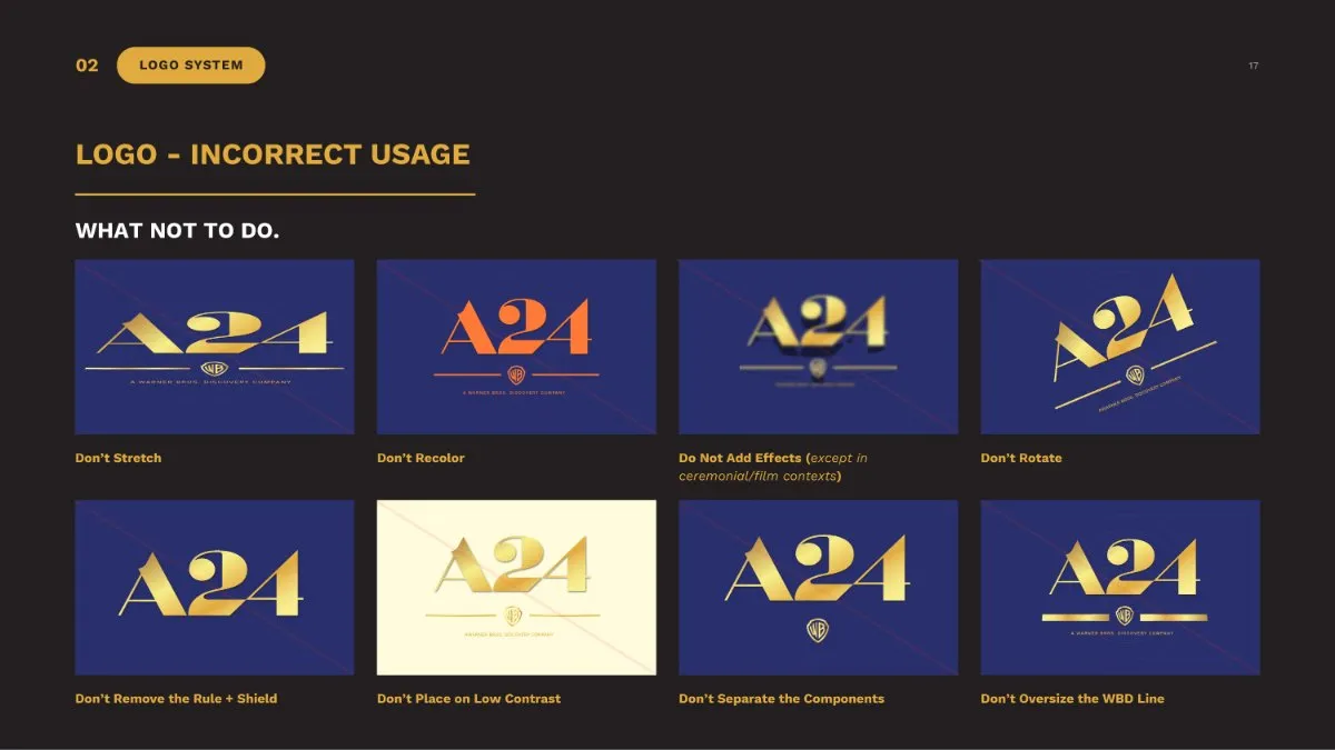
A hypothetical project, and brand strategy, not UX research. I invented the acquisition and wrote the guidelines as if presenting to a real client. It shows how I handle a hard constraint, and it includes an accessible color system. It is an independent student project and is not affiliated with A24 or Warner Bros. Discovery. The logos belong to their owners.
Constraints and what I’d change. I worked alone and under a tight timeline, and a 44-page system deserved more rounds. My professors felt the logo didn’t look quite right. I kept my proportions because the brief asked for strategic accuracy more than polish, and I could explain each one against it. If this were a real engagement, the next work would be governance logistics, a cost structure, and making sure the system could be built at WBD’s scale.
Process notes
The accessibility standards page
What the package includes
A 44-page guidelines document (logo architecture, clear space, color, type, voice and tone, image treatment, accessibility and governance), 10 logo system finals in Theater Black, Director’s Blue and Screen White, and a strategic creative brief.