Frolic
A CareerFoundry project from 2024. It shows my planning and competitor research from earlier in my training.
- Role
- Solo UX designer
- Team
- Solo project
- Timeline
- UX Immersion, CareerFoundry, completed 2024
- Status
- Complete (certificate project, 2024). Research planning, competitive analysis and survey results shown here.
- Methods
- Competitive analysis (Flo, MyChart), SWOT, marketing review, problem statement, user stories, survey (14 responses), interview plan
The Brief and My Focus
CareerFoundry asked for a responsive health and wellbeing portal, designed mobile first and with inclusion in mind. I focused on hormonal and reproductive health. My problem statement: people need a reliable way to monitor their hormonal and reproductive health, and a supportive tool that keeps them informed as they go through changes.
What I Found, and the Risks I Saw
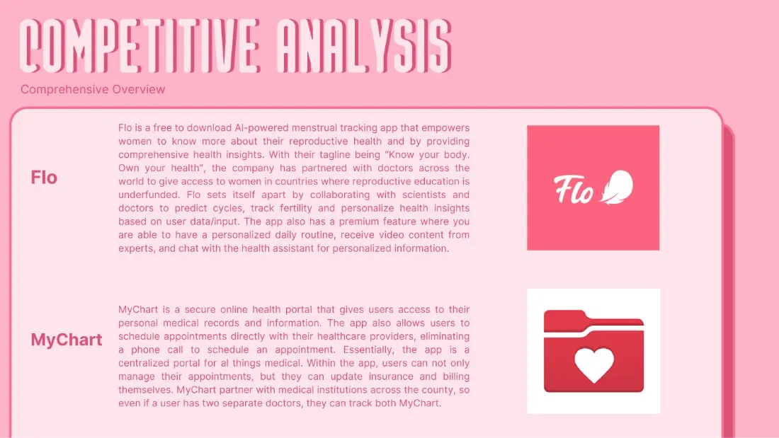
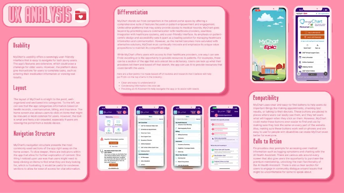
I compared Flo, a menstrual and fertility tracker, with MyChart, a patient portal tied to medical providers. Nearly all of Flo’s standout features sit behind a paywall, and both apps raise privacy questions. I thought MyChart’s text felt small and crowded on mobile, and that Frolic could help by explaining medical terms in plain language.
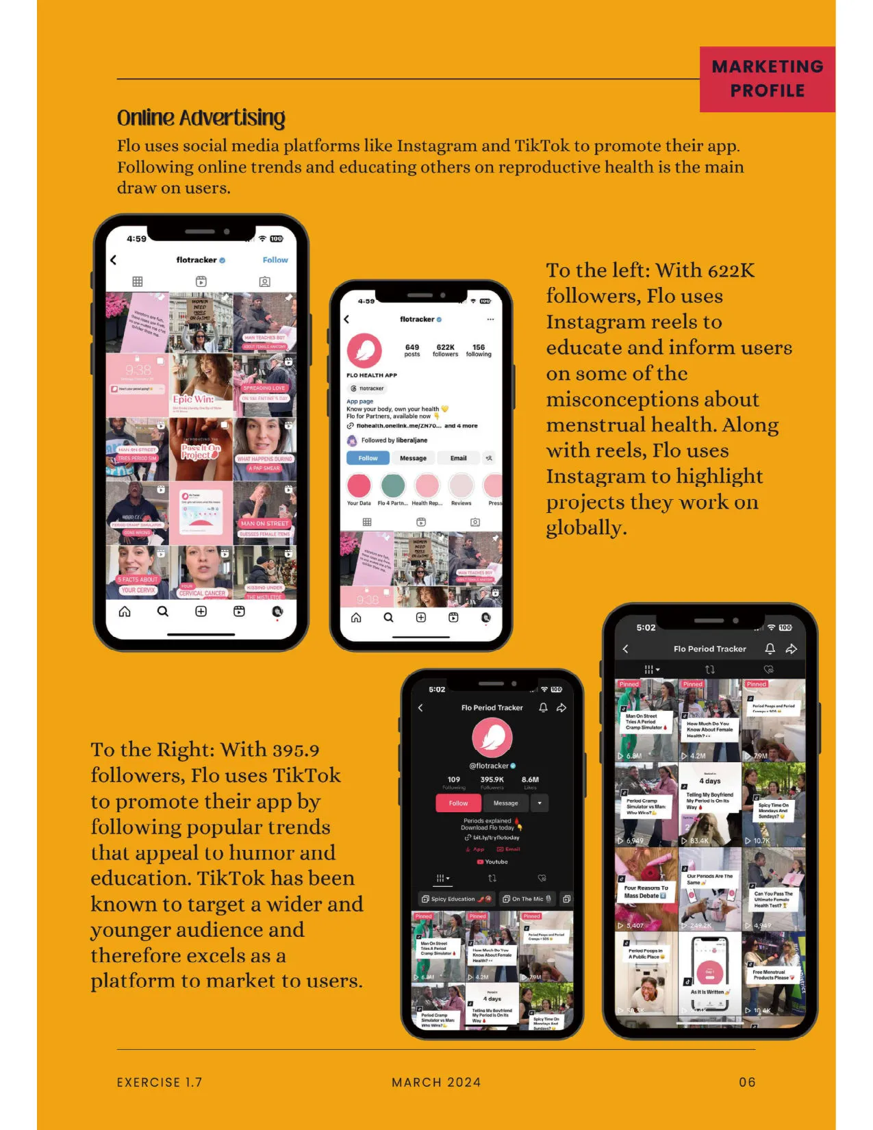
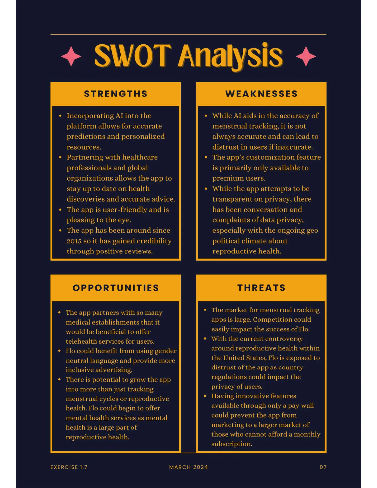
Flo. Flo reaches people through word of mouth, search, Instagram and TikTok, and partnerships with medical and research groups such as Mayo Clinic, Northwestern University, the University of Virginia, Texas Christian University and UNFPA. In my SWOT, its customization is mostly for premium users, and its privacy practices draw complaints. I also noted a user complaint that features locked behind a monthly fee fall on people seeking reproductive health care, which some call a “pink tax”.
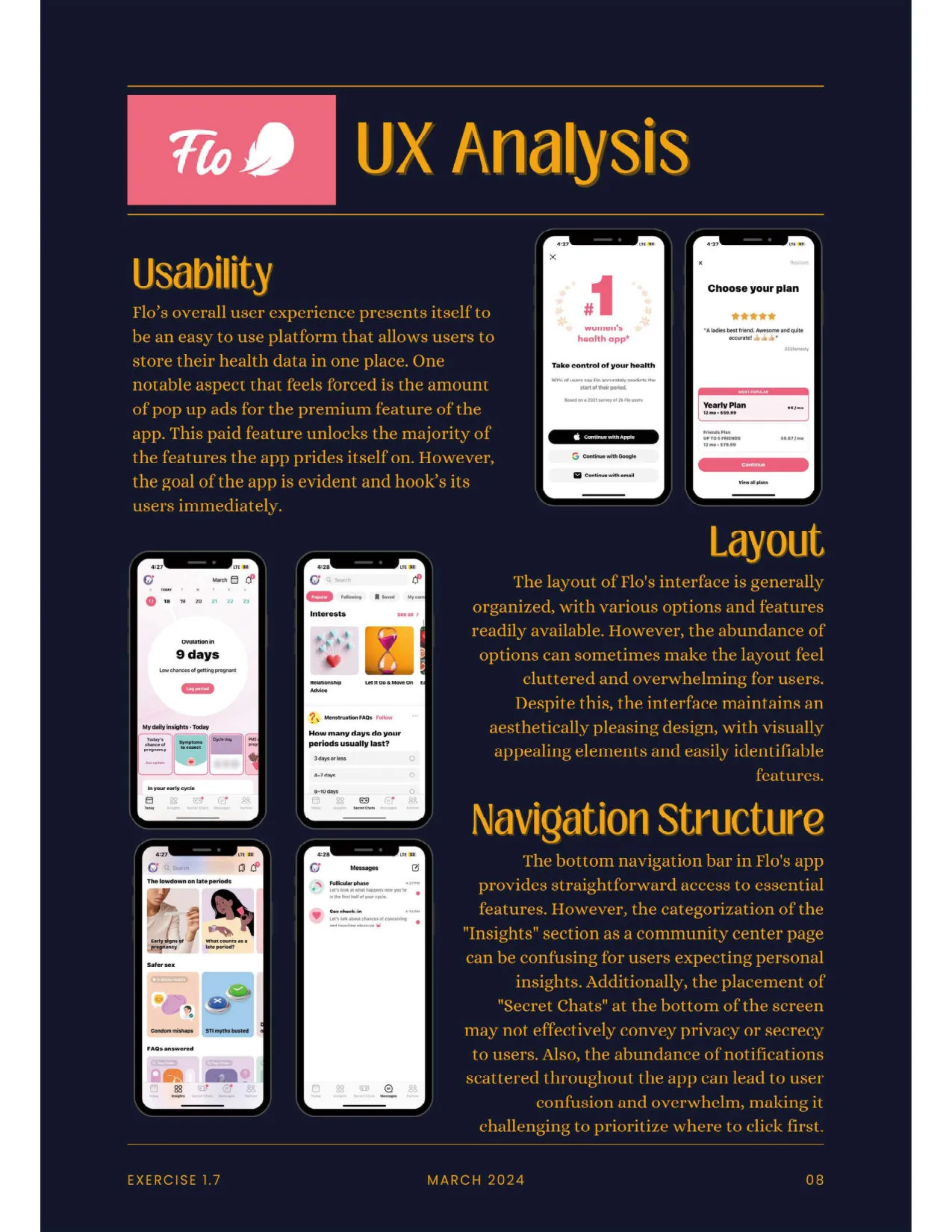
Flo’s UX, from my review. Flo launched in 2015 and, in March 2024, showed 4.8 stars from 1.3 million App Store reviews and 4.6 from 3.37 million Google Play reviews. I found it easy to use and good-looking, and it keeps your health data in one place. But pop-up ads for the premium plan feel forced, and the paid tier unlocks most of the features. The layout offers so many options that it can feel cluttered. In navigation, the bottom bar gives straightforward access to the main features, but the “Insights” section mixes in community content in a confusing way. The “Secret Chats” placement doesn’t make the privacy of those chats clear, and notifications are scattered through the app. Its calls to action are clear, such as logging symptoms or chatting with the AI health assistant, though ads to buy premium appear on nearly every screen.
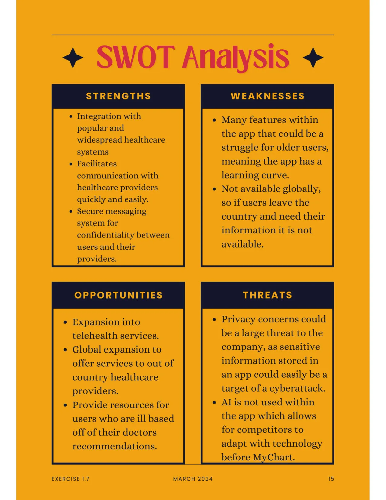
MyChart. MyChart markets to healthcare providers rather than directly to patients, and works with Epic, a patient-record network used by health professionals. In my SWOT, its strengths are integration with widespread healthcare systems and secure messaging with providers. Its weaknesses are a learning curve for older users and no access outside the country. Its threats are privacy and cyberattack risk, and no AI in the app.
What I took from it for Frolic. A more useful free tier, a privacy policy written in plain language, and a section that works like a dictionary, where a patient can look up what a provider told them and get resources about it. I also suggested an AI assistant to help people find their way around, and putting information in one place. These are my ideas from desk research, not tested.
| The risk I saw | What it needs | My idea |
|---|---|---|
| Health details are sensitive, and people may hesitate to put them in an online profile. Hypothesis | Enough trust to share them. | Explain the privacy policy plainly and let users customize their privacy settings. |
| So many features could make the app cluttered and hard to navigate. Hypothesis | Easy navigation. | Group related topics into sections and add a short tutorial in onboarding. |
| If people stop using a health app, it fails. Hypothesis | A reason to come back. | Habit tracking with rewards, community groups and notifications people can customize. |
| Scheduling with doctors needs agreements with medical offices and systems that connect. Hypothesis | Offices willing to partner. | Offer offices an incentive to collaborate. |
What the Survey Said
Fourteen people answered my online survey in July 2024. Two responses were jokes, so I left them out and the counts below are out of 12. Eight respondents were 25 to 34, one was 45 to 54 and three were 55 or older. This is a small, informal sample, so it points to ideas worth testing and doesn’t show what people in general want.
| Question | Result |
|---|---|
| How important is ease of use? | 11 said very important, 1 said important. |
| Biggest challenge managing health | Scheduling and remembering appointments (7). Managing symptoms (4). |
| What keeps you from using health apps more | Lack of useful features (8). Privacy concerns (4). Lack of time (4). Cost came up in two written answers. |
| How often do you abandon apps over poor design? | 5 very often, 2 often, 4 sometimes, 1 rarely. |
| Most important features | General health tracking (10). Mental health support (8). Doctor appointment reminders (7). Menstrual cycle tracking (6). |
| Personalized content people would find helpful | Tailored exercise plans (11). Customized nutrition advice (9). Stress management techniques (8). |
| How important are social features? | 2 said important, 5 neutral, 5 said not important or not at all important. |
| How important are mental health resources? | 8 said important or very important. |
Privacy came up in the written answers too, in respondents’ own words: “The government is going to see my stuff” and “Info being given to other companies or people.”
What this means for my ideas. The appointment and reminder result lines up with my idea of scheduling with doctors, and the privacy answers support a plain-language privacy policy. Only two people called social features important, so community groups are the weakest of my four ideas. I haven’t tested any of these ideas with users.
Early work: desk research and a small survey. I wrote a survey, a 16-question interview guide and user stories, and I have the survey responses (14 people, 12 counted below). I don’t have interview results, personas, wireframes or a prototype to show.
Constraints. This was a course project with no real client, and the survey is small and informal. I list the risks I saw (privacy, a cluttered interface, doctor integration, engagement and personalization) with a possible answer to each, but none of the ideas has been tested with users.